Colour Printing
Today was a lot!
I had a thought about the ‘book’ I was thinking of making, a thing based on ‘The Grammar of the Ornament’ and the posters I’ve been making. These would work as the ‘plates’ in the GOTO but the main difference is colour. I’ve been making and printing them in black and white as an effort to deal with the form of the design and unify the whole thing, but I think if I’m going to analysis them fully I need to deal with the colour. Especially having read work by John Hence who was such a large Proponent of colour theory.
So I wanted to know if I could print the whole book myself. Initially, I thought I could design it and get it printed digitally, but would love to be able to hand print the whole thing and bind it and make a cover etc. but I haven’t done any colour printing as of yet, so needed to figure that out.
So I went to YouTube. I know enough about printing to know that I needed to split the designs into the 4 print colours; CMYK (cyan, magenta, yellow and black), and then the halftone each colour plate so they can be printed on top of each other. I watched this video to help me do all this: https://youtu.be/DLX5FPrOmpE?si=C9evILGSFnQ341vS
The configuration I used whilst halftoning was:
Black: 45 degree
Yellow: 0 degrees
Magenta: 75 degrees
Cyan: 15 degrees
All with the ‘frequency of 53.
The first issue I had was getting the digital printers to print the plates as I needed them! For some reason some of them were just printing blank, but still printing the registration marks. I finally got that to work. I made the screens up and ran through the process, using a hair drier between prints so I didn’t have to wait all day for them.
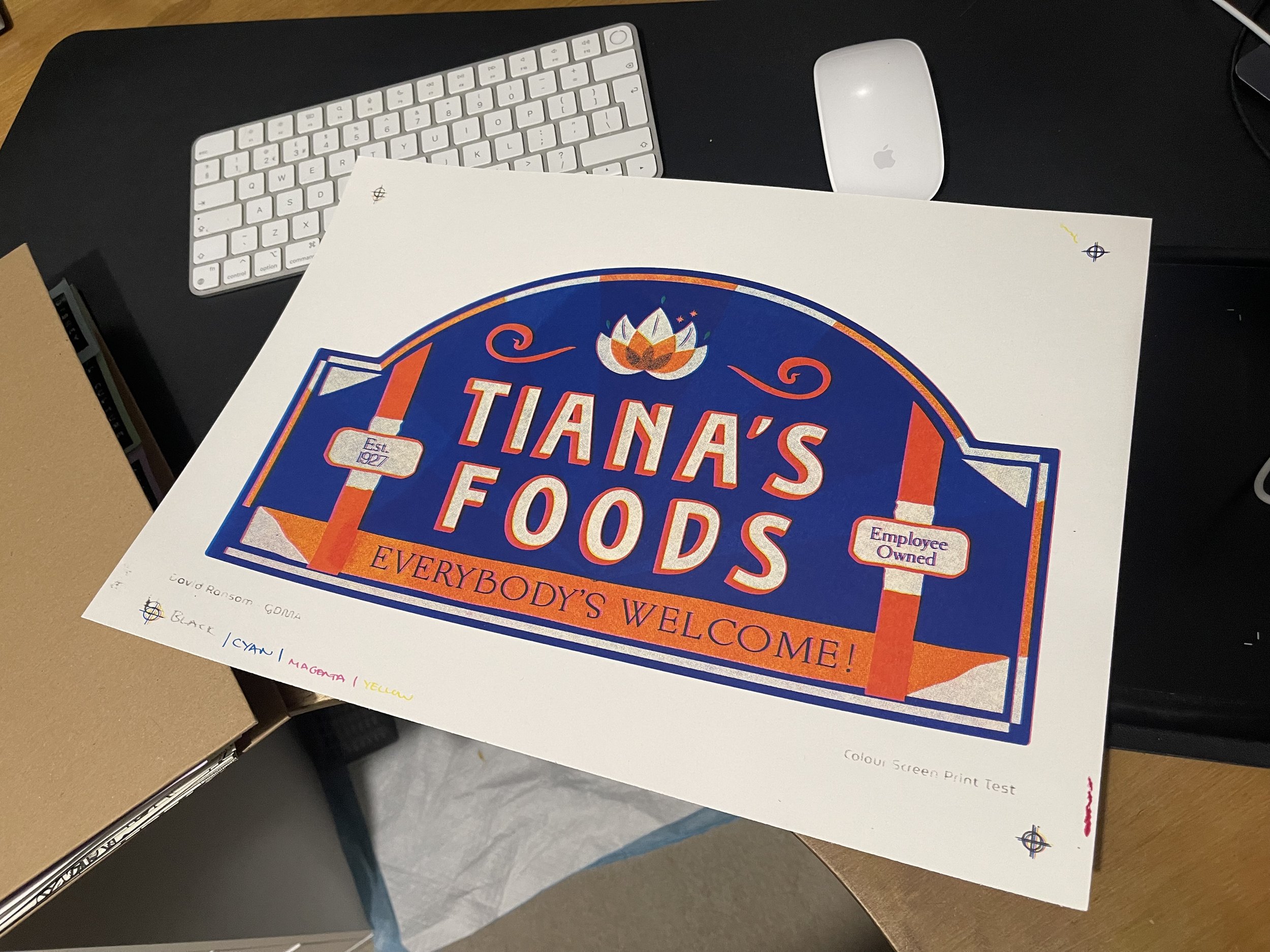
Anyway here are the results:
Looking at the final result vs the original design, the yellow has gone orange, which has blended with the other orange in the design, and the actual orange is nowhere near the correct colour.
I think the results are interesting and it was a good experiment to work on, but I need to sit down with Matt, the print studio tech to figure out what I did wrong or how I could improve.
The YouTube video mentioned something about knowing the design of the screens in order to know how big to make the halftone dots. This is what you set the ‘frequency’ to I think, so I need to figure that out for next time.