
In response to the online tutorial delivered by Fraser Davidson, I decided to experiment with his technique of designing mascots. I followed his instructions as closely as possible in order to ascertain the success and challenges in his techniques in regards to my own practise.
In order to not rely too heavily on his results, I didn’t want to recreate his image of a lion so I chose a different animal, completely at random. This meant I would be forced to take his lessons and adapt them to a different image, allowing me to dive into why and how they work, not just recreate them.
I found this stock image of a fox in a pose that worked for what I needed. In Davidson’s tutorial he suggests using statues as references points, with good reason, but the downside of this is having to find the exact statue in real life. I feel the internet is a much wider resource for this.
Here is the image I used:

The second way in which I deviated from tutorial was in the line drawing aspect. In Davidson’s work he moved straight into Adobe Illustrator, using the pen tool to sketch out the feature lines of the animal. This is the result of honing his skills over many years, using the pen tool in this specific way. I, on the other hand, feel like I would achieve better results using a pencil and pen, and so I marked out the lines and thickened them up with a sharpie after, as per this image:
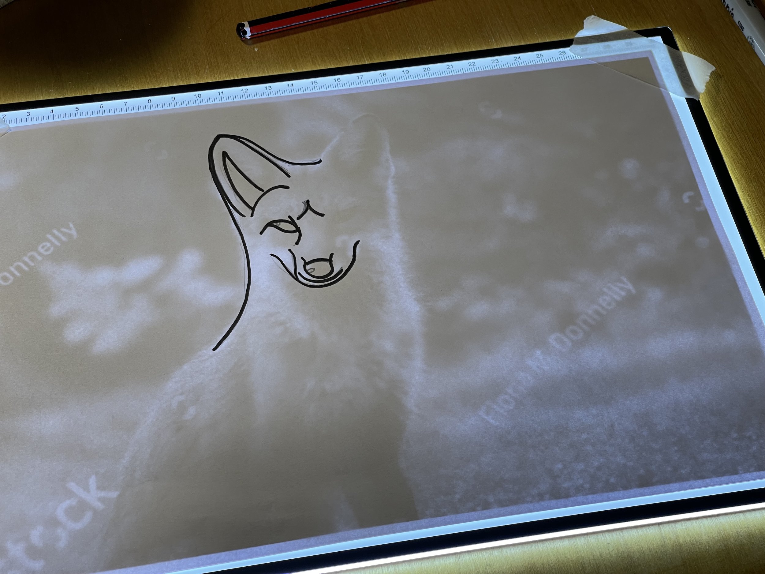
The next step was the scan my line work and place it over the image.

Once in Illustrator, I followed Davidson’s process of thickening the lines, using that as a guide and then simplifying everything.


A real challenge for myself in this work was to move away from the reference image as quickly as is done in the tutorial. In the past I have always relied heavily on the original stock image and I think this is what has always lead to my illustrations being over complicated. Moving away from this I feel gives the chance to view the illustration as its own object and make changes based on what’s best for it, not on making it look like the original photo.
Here is my final image/logo/mascot:

In the tutorial, Davidson uses a secondary colour to tie the drawing texture but, because I didn’t want to run before I could walk, I’ve left it monochrome. I want to get better at the first step before moving onto anything more complicated.
I think on the whole, this is an ok first attempt. I think the shape of the foxes head is a little odd and needs refining, or made smaller. I also feel like I didn’t have enough structure in the original reference point. I think for the next version of this experiment, I want to combine what I’ve learnt from speaking to Darren Tate about his process and this style. I want to use more geometric shapes to get the proportions of the different aspects of the animal more appealing. I also want to go through some other tutorials and speak to some more people about their illustration methods to get a wide range of processes to take inspiration from.