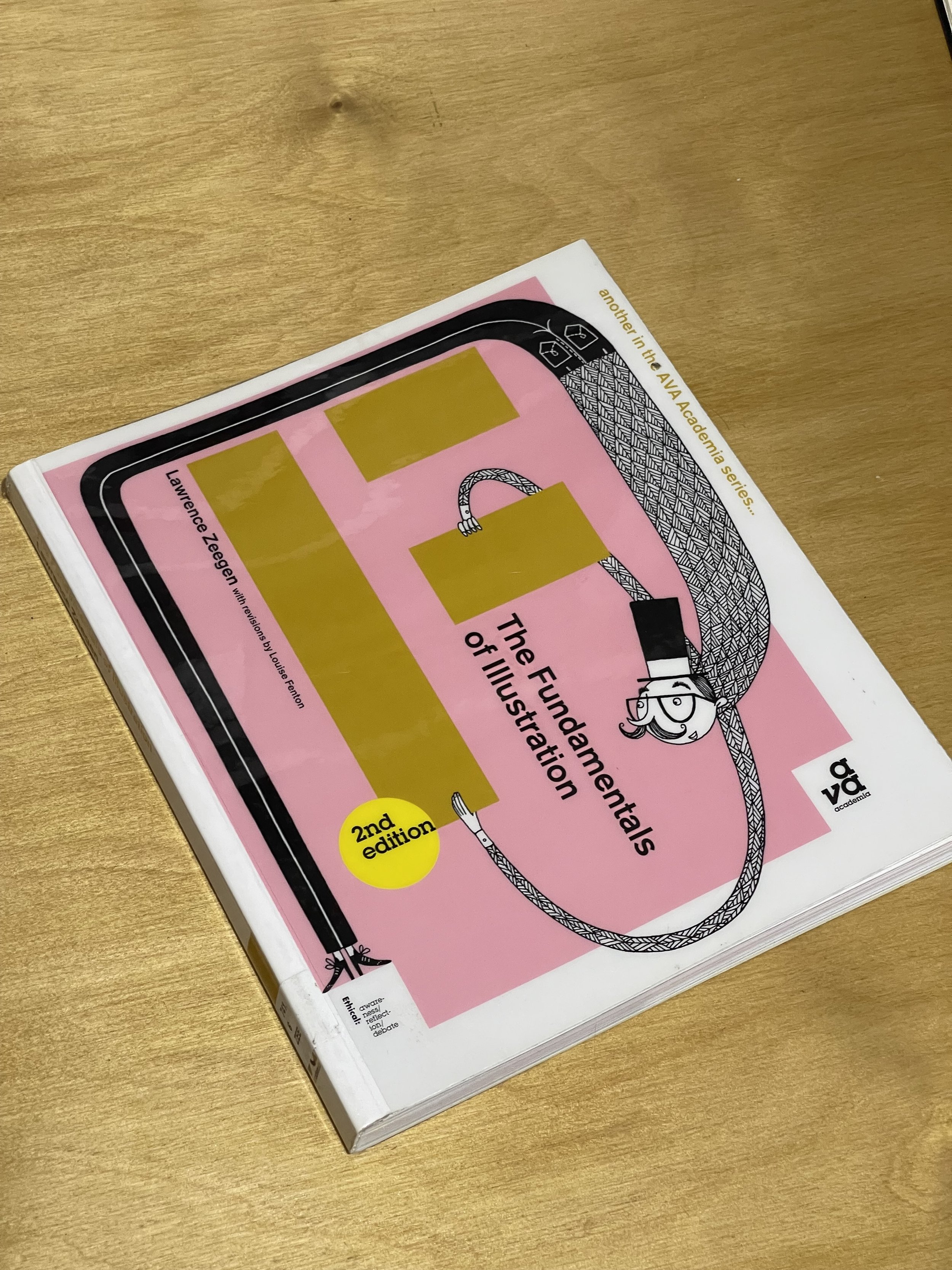
The Fundamentals of Illustration by Lawrence Zeegen
As part of my journey into revising or reviewing my positionality as a logo designer, I needed to start looking into the broad strokes ideas behind illustration and what it means to be an illustrator. Even though my need to be an illustrator is niche, in that I need to design or draw things that will work as logos, and therefore on different mediums and scales. It makes sense to look at illustration with a wider lens, and to start at the beginning, as it were.
I looked at the book The Fundamentals of Illustration by Lawrence Zeegen primarily as the title infers, this would be a good place to start! It’s important to me to know how and why illustrators produce the work they do, and what goes in to defining a style for themselves.
Zeegen puts forward the idea that an illustrators style does not come primarily from their desire to use that specific method or material, but more the devises they excel in are the ones that they develop. This is because they produce successful results and therefore follow that course of action. He states that “Much of the struggle towards professionalism can be about the materials and processes that the illustrator starts to excel in work with;…” (Zeegen, 2012) which implies there is almost a ‘cart before the horse’ methodology when it comes to defining a niche or style.
It can therefore be concluded that wide experimentation is the key to defining a style of working. But this can bring up a range of issues in itself, namely the scope of processes, materials and methods to create meaningful work that is “visually translated using the most appropriate media, with excellent execution, will always lead to the most successful illustrative solutions.: (Zeegen, 2012). In his book, Zeegen explains that having “historical and subject-specific references to materials ensures messages cannot be confused…” meaning that is it not only important to have a good grasp on what materials are available to use, but also to know why those materials would be used and what that could mean historically. Feeding these ideas back into logo creation, it is not appropriate to start using different materials to create work; a logo is usually always going to need to be a digital vector file, but it does relate to the digital texture and style of the logo. As much as there are historical references for physical materials in illustration, there are historical ones in logo design. You wouldn’t expect a straight laced, formal, important bank to have a lively, bouncy, illustrated cartoon as their logo as the message would be lost. Unless this was their intention.
This is why the positionality of the illustrator and designer, or both if they are the same person, is such an important blend. “”Understanding how the industry operates and how the numerous sectors functions fundamental to ensuring that the relationship with graphic design can be most fruitfully exploited.” (Zeegen, 2012). I believe it is important in the next steps of my research to speak to people working in industry to ascertain how they work with illustrators, or designers or both to create successful work.
Visible Signs. An Introduction to Semiotics in the Visual Arts - David Crow
I was recommended this book to read alongside my illustration research. As the end goal is to create better logos and add more range to my skill sets in design, it is also important to know how to best integrate those illustrations and the logos and design work I produce.
The fundamental idea of semiotics is the study of signs and the “..relationship between the components of the sign that enables us to turn signals, in whatever for they appear, into a message that we can understand.” (Crow, 2007)
Semiotics was developed in the early 1900’s simultaneously by Ferdinand de Saussure, a linguistics professor and Charles Sanders Peirce, and American philosopher. Pierce broke the ideas of signs and semiotics down into three categories: The Icon, which is described as the image of a thing, e.g. a building. The Index: a sign that has a link between itself and the meaning e.g. smoke=fire. And Symbol, where there is not logical connection between the sign and the meaning but it is understood what each mean by a learned system taught to us: red cross=first aid, flag=country (Crow, 2007). It is interesting to compare these categorisations of signs with the categorisation of logos I discussed in my earlier blogs. There is clearly a lot of crossover and therefore can help in their understanding and use.
The idea of Semiotics in logo making, is largely due to the use of metaphor or metonyms “a word or expression that refers to something using the name of one of its qualities” (dictionary.cambridge.org). The goal is to create the idea of the brand / company / person pictorially by creating something the defines them and is instantly recognisable. “When we substitute one word or images in a sequence for another, we can transfer the characteristics of one object to another.” (Crow, 2007). Not only is this important to understand why certain icons and symbols can be used in logo creation, but it is a powerful tool to be able to put words to these ideas when explaining a thought process behind an idea.


