
Furthering my research into mascot logo design, I worked through a few more tutorials on skillshare.com. The first was “Mascot advance logo design: Adobe illustrator cc” by Mirza Usman Baig. Though this course was very similar to the original Davidson one I worked through a few weeks ago, it was still very useful. It’s good to hear the same ideas reinforced by other designers, as it means these are used across the board in mascot design.
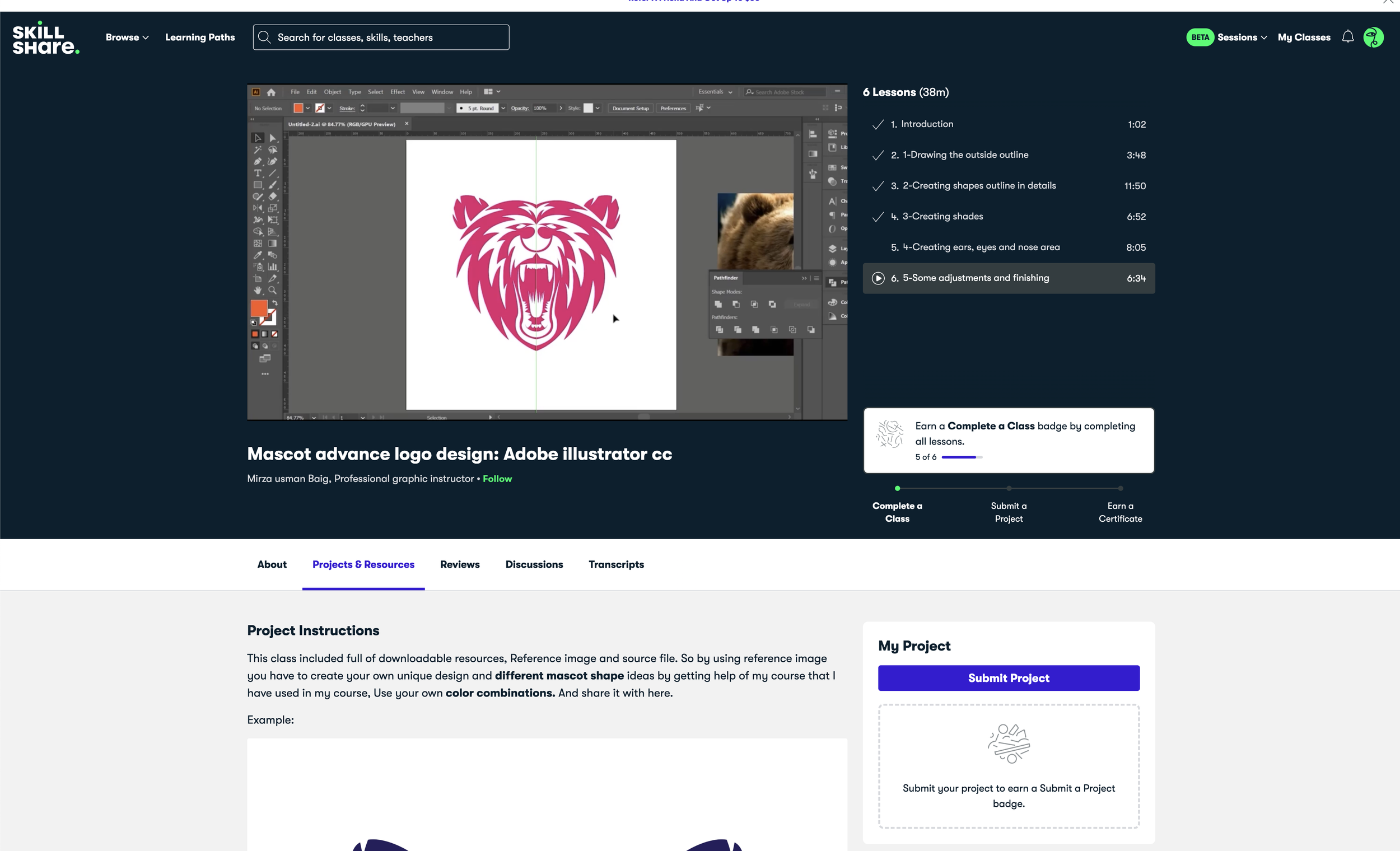
Similar to Davidson, Baig used a reference image of a bear to ‘trace’ over the key aspects for the face and then extrapolates the design from there. Baig uses a method of drawing half the face and mirroring, the same as what Davidson did. It makes sense that you would want to have a fundamentally symmetrical logo mascot - I say ‘fundamentally’ as this is famously not the case in the Starbucks logo. The drawbacks with this method, for this tutorial, is that this will only work for a face on mascot. If you wanted a side profile or 3/4 profile, you wouldn’t be able to use this method.
The main issue I’ve been running up against with these tutorials and also during my conversation with Darren Tate at the beginning on this project, is the way people talk about their work. This was something I encountered in The Reflective Practitioner, (Schon, 1983) and is an inherent problem with watching a pre-recorded tutorial such as this. The decision making aspect of the process is often taken for granted or overlooked. I did not feel like a was watching someone make these decisions and therefore, this design for the first time. There were choices made in the drawing stage that were so ingrained in the illustrator that it felt like watching someone trace a project that had already been made.
The second tutorial in this style I viewed was “Learn how to create a Professional Sports and Mascot logo” by Milos Jevtovic.

Jevtovic begins this process slightly differently to the others. Milo uses the sketching software ‘Krita’ which is new to me, and I’m not 100% sure why he didn’t use Photoshop or Procreate, but everyone has their own process. He used this to sketch out the rough lines, shape and features of the Rams Head he was designing, again from a reference image. This was good to see as it was fundamentally the same beginning stage as I have used. The only difference is that I used pen and paper and he used a digital means of creation.
What was interesting to see however, was that once the sketch stage was complete, Jevtovic turns off the reference image completely! He takes the first steps from the reference and then commits to producing a completely new design based on is. This allows the freedom to make choices that serve the design not the reference image and don’t tie him down to anything but his own process. This is shown acutely in the time he spends working and reworking the horns of the ram.
Unfortunately once again, this video has the same issue I keep encountering where the designer, illustrator, narrator does a lot of things and makes a lot of decisions based on seemingly nothing and makes no attempt to explain why they were made. Jevtovic is clearly a talented illustrator and knows how to achieve successful results. But, the only way to gain any understanding or skills knowledge, from this is to watch him work and try to learn through osmosis. This can be difficult when trying to understand what you have learned and how you can apply it to your own work.

The last tutorial I watched was Drawing Cartoon Humans! By Dave Reed. Clearly this is quite a departure from the mascot logo style of tutorials I have been watching so far, but I think it is important move away from that structure to give myself a wide range of knowledge areas that I can learn from, understand and bring into my own work.
Tracing has always been my method when it comes to illustration. Either starting from a reference image or from using bits of other illustrations to Frankenstein work together. But Reed states that “tracing might get you out of habits that you don’t even realise you’re doing” (Reed, 2022). This is obviously a good tip if you’re branching out into new techniques of illustration, but might not be ideal if tracing is the habit you’re trying to break away form
Procreate is a widely used piece of software for illustrators. Reed uses it here and Darren Tate used it in his bumblebee sketch earlier in my research. I need to spend some time playing with it.
It’s very interesting to watch Reed work with no reference image at all. All the tutorials I have worked through so far have used real life images to start their sketch with. It could be assumed that this is because we are dealing with cartoons here and not realistic proportioned figures. This was the same with Darren Tate when I interviewed him. It is again interesting to think that these illustrators have those images in their heads ready to go, or is this another example of not seeing the full process of the drawing?

We get into the same areas of communication and potential issues around them as we did in the other videos here. There is a section where Reed is refining the eyes of the character and he states “you know me, I like to add this line above the eye!” Reed here adds a line above the eye to denote the fold in the top of the eye lid. But the issue as always, is why? I don’t ‘know him’ and I don’t know why he does that but it’s successful and makes the design better. I can only assume he did that once, realised it worked on every design and applied it every time.
I’m starting to feel that I have taken the online tutorial learning process as far as it can go. I need to start speaking to people one on one so I can drill down into these questions as I don’t think these issues will fix themselves on their own.
The only other takeaways from this video were a few tips of drawing and using the software, such as using the liquify tool in Procreate (or Photoshop) to make things larger or move them around. Never put the eyes in the dead centre of a drawing as this gives them a ‘dead stare’.