
Using the techniques I have discovered and learned on the online tutorials from Baig, Jevtovic, Reed and Davidson, I wanted to once again experiment with a mascot logo to provide a benchmark to compare my first fox logo to. This time a chicken…

Using the illustration techniques explained to me by Darren Tate at the beginning of this project, and combining them with the outlining techniques discussed by Davidson, I started this by marking the ‘Lines of Action’ and also the main sections of the chicken.
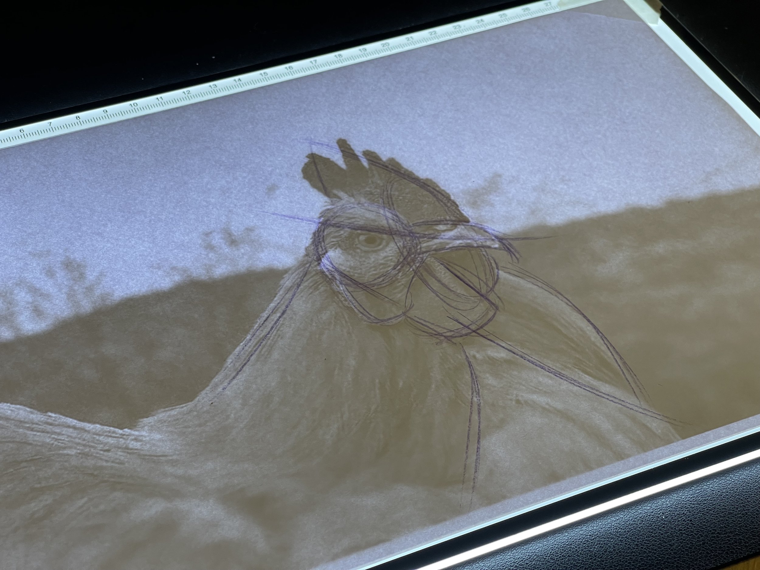
Using the reference image, the section lines and the lines of action, I started to flesh out the image of the chicken and then brought this image into Adobe Illustrator.
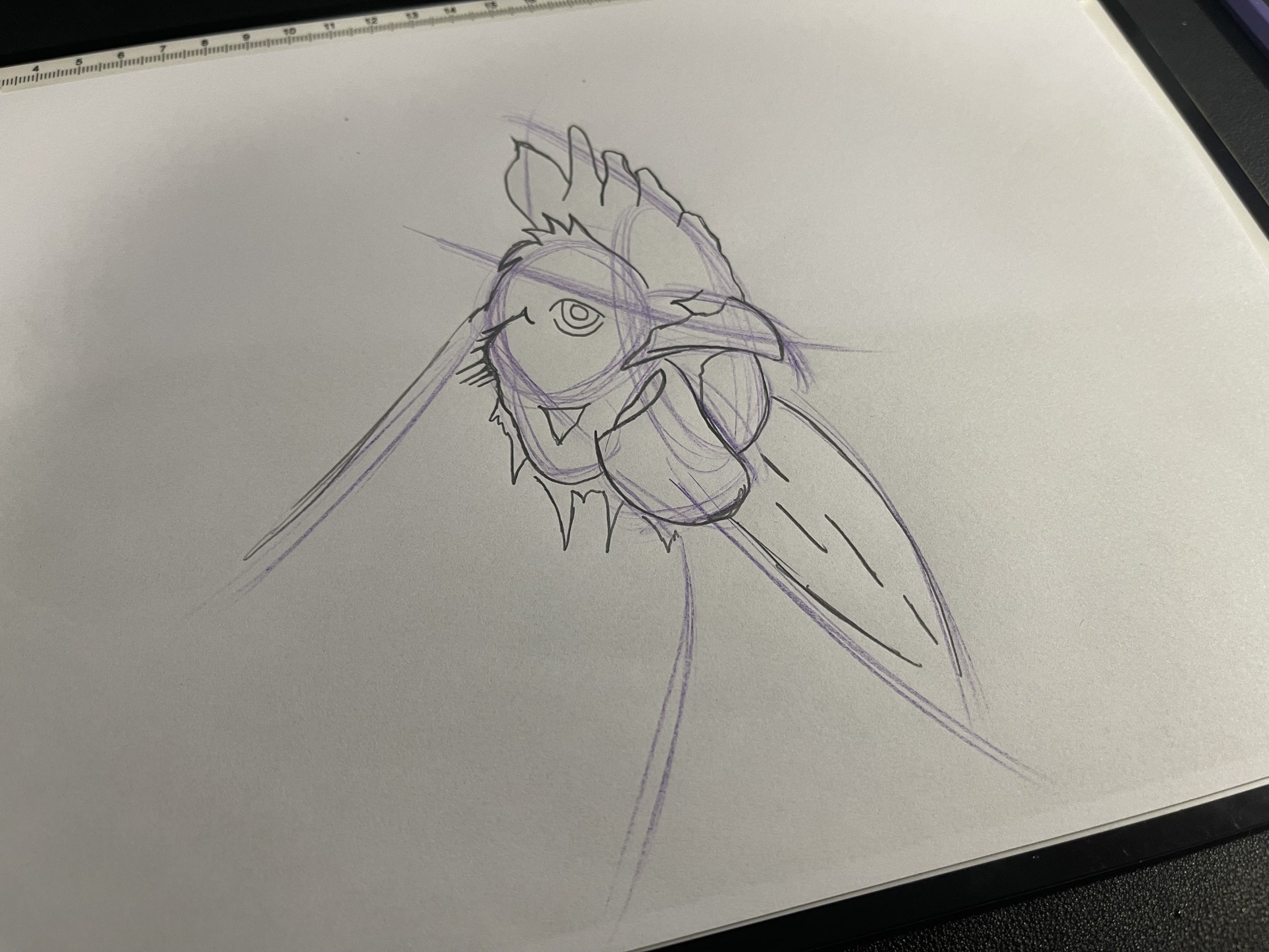
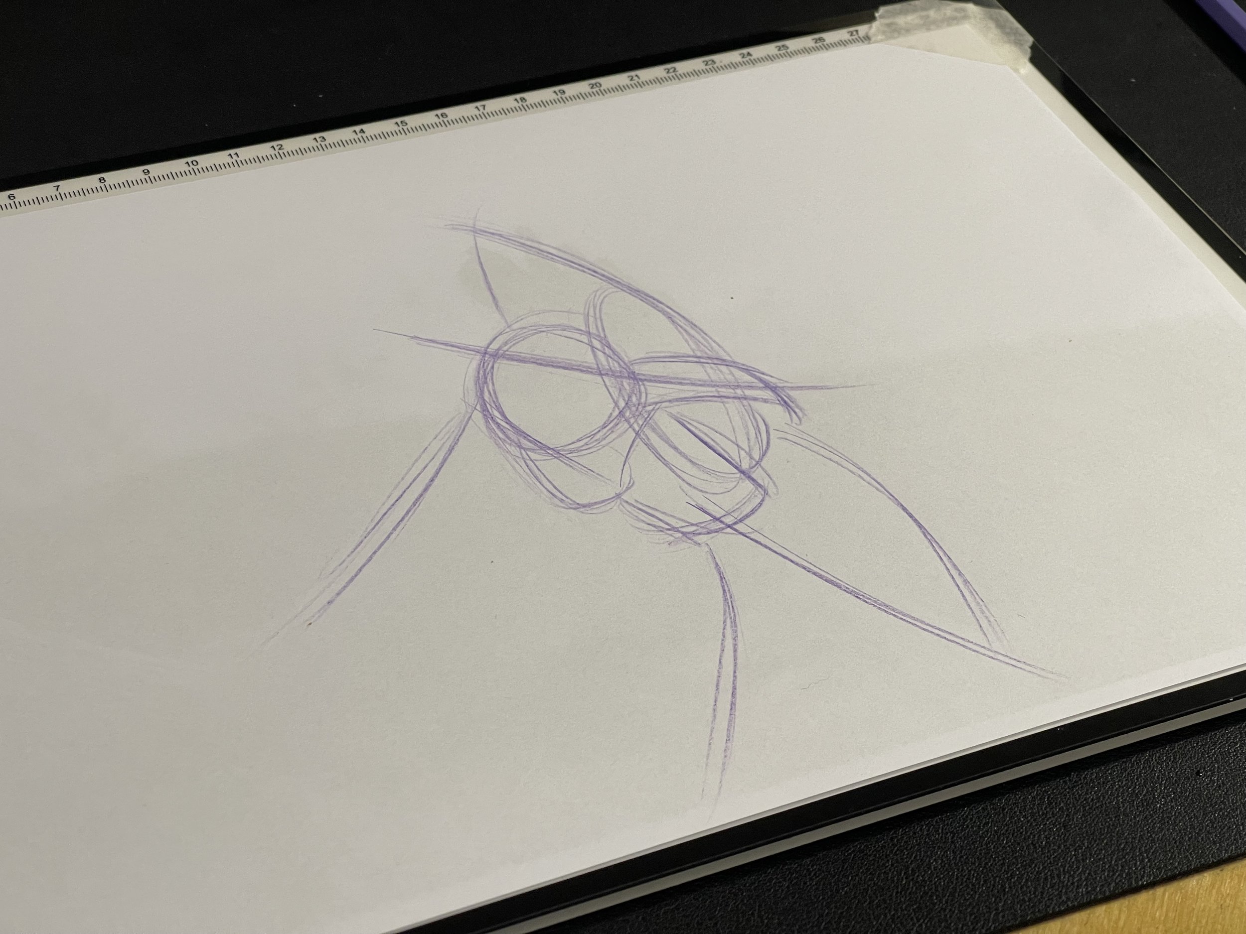
One of the key take aways I’ve learned so far during this project, is to move away from the reference image as soon as possible and to use the last iteration of the image as the reference for the next. This allows you to be unrestricted and move away from making choices which might make the final product too realistic, or too close to the original reference image. And so I began the process of vectorising my sketch.

I wanted to caricature the image somewhat in order to give it expression and dimension. Using the techniques in Reed’s ‘Drawing Cartoon Humans’ course, I simplified the comb (the red flappy bit on top of it’s head) of the Chicken, stretched and enlarged the beak and enlarged the eye to fill the space around it (this was to make it a larger focal point and give it an angry glare). This worked for the identity of the fictional sports brand as an aggressive mascot. This wouldn’t work out so well for a chicken restaurant for example.

Once this was complete, it was simply a case of finishing the logo of with type and an emblem and colouring the chicken. And so The Blue Chickens were born!!

