6th May Tutorial
Having finished the research on the primary source material, ie. The books and documentarys and interviews specially about WDI or Themed Entertainment Design, I can a, start putting together the written part of the product I’m creating, that being the companion book, and B, start widening my reading out to include all the material that is going to help me answers the why’s and where’s and what for’s of this project.
Mike suggested that what I need to do is start thinking about the fact that I am a Graphic Designer, looking at these spaces in theme parks through the lens of a graphic designer. What does that do and allow me to do that is different from other forms of looking at these things.
He suggested a few books to look at to help me frame these ideas based on the early days of graphic design. In which I mean what is it for, what does it do. What can be done with it. By understanding those ideas I can then turn them around to ask, what does it allow me to see things as?
Graphic Design is largely seen as a service industry. A method of expressing other peoples ideas and brands and products. It’s responsive. So what if it was used as the starting point, the jumping off point?
Some books Mike recommended are:
Emil Ruder - Typography: A Manual of Design
Armin Hofmann - Graphic Design Manual: Principles and Practice
visual transformation | walter diethelm
So I’ll start with those and see where that leads me
19 Weeks to Go!
Mike kept saying this was a long time away but that really put the panic in me! I was talking to Non about this the other day, about how I remember September 2023 going to the Starbucks by the station on my first day and now suddenly I’m almost done. Very scary! But luckily I know what I’m doing, I just need to get through it.
A couple of dates to be aware of: 27th May. So just over a month away, we need to have a second version of our prototype, which I already did a version of a poster for the first draft. This was a combination poster of a range of designs from the other posters, to give an overview on the whole project. But what I need to do for this one is actually but something together that is a prototype of the thing I’m going to hand in.
I’m currently at 12 posters, well almost 12, so that leaves three more to make which will be good to get made and stop doing as they’re quite time consuming. I also had ruled a line under my Disney based research, but then speaking to Greg Randle the other day he put me onto ‘Themed Entertainment Design’ by David Younger, which is too good of a book to pass over. So once I’ve read that, and the Architecture of Reassurance, which I’m currently working through, I’ll stop there. There will probably be a few more ‘academic’ books to go through, semiotics, physcogeography etc but they will be filling in gaps as apposed to big learning.
So I need to start working on the other analytical writing on the studies. What I’m starting to realise though is that those don’t need to be super in depth. I’d like them to be comprehensive and well written, obviously, but talking this morning about who this project is for, they can be quite surface level so they are inclusive for all audiences.
The second date is 3rd June. Which is the interim presentations. We’re making posters and showing items from our projects in the BA end of year show, but obviously this isn’t our end of year, so they’re just WIP. I was thinking I need to include the studies i’m doing, but also the text I’m writing and some bits about my process. So I want to print out the WDI timeline I made at the beginning of the project and also make a short film about the process of making the prints. So I need to put that together and also edit the sound scape recordings I did whilst at the parks. These are all on my to do list, just need to get them sorted alongside the posters until they are out of the way.
I also want to play around with the printing of the book on some form of archival paper so will play with that for this show.
I also need to produce a 300 word statement about my work, but I don’t think that’ll be too taxing.
A few things that come up during the chat this morning, was about if what I was making was a product to be sold, where would that happen, what would it look like and how would I make that. This will give me some ideas about how to present the thing in the final stages. So need to look into options for that.
Also something to add into my critical analysis is the idea of trusting the process of experimentation. In the self reflective section, I need to remember to talk about the fact that I did experiment but came to conclusions on that very quickly. I also looked back at my proposal this morning and realised I’ve stuck to my timeline perfectly and havent really deviated away from my original plan at all. I don’t know if thats a good thing or not, but it’s what’s happened so who knows! I’ve spoken to Mike about this before, and I think because I’ve learned through working, I’ve always worked to a brief, and had a short amount of time to achieve what I needed to achieve. Therefore I’ve also thought of the solution quickly and then set off doing that. Park of this project was meant to do the opposite of that and play around with stuff to see where it got me. Which I think it could’ve done a lot more of if my brain wasn’t wired the way it is!
Pychogeography and Graphical Information
This week and next week and last week are / were easter break. Last week I got spent my time finishing up the posters from Paris. Well not finishing up but getting the current ones up together. I was spending a lot of time working on the posters and getting a little tunnel vision getting them completed, so I’ve decided to take a break from them for a minute to get some other things sorted that I’ve been putting off. I’ve got 4 or 5 left to do but I really need to start thinking about / working on the companion book and the analysis writing of each one. I obviously did a first draft of jungle cruise but I need to flesh that out and make a system to write about these studies.
I was in Portsmouth yesterday with a plan to get all the remaining posters printed and then spend the afternoon in the library. But it didn’t exactly go that well. I was rushed for time printing and so made some mistakes setting up the screens. Namely the hotel one came out with lines that were way too thin and wouldn’t have shown up on the print. So I washed that out, spent ages on the uni computers to remake some of the patterns and then reprint and prescreen it. I think I messed up the emulsion as it didn’t cover the whole screen so I had to do two passes. We’ll have to see when I print.
The reason I havent printed yet was because I went to get some paper and the art shop was closed! Awesome. So I’ll finish that up next week.
My plan for the library was to knock out some of the non disney reading I’ve had on my list for ages. I feel like I’m getting to a place where I’ve read and watched and listened to almost everything I can at this point, and it’s starting to feel like I’m just hearing the same information over and over. I have got another interview lined up next week so that’ll be good. I think once I’ve finished the last of the books and podcasts I have on the go now, I’ll draw a line under the disney of it all and focus on the academic stuff. If more interviews come up, I’ll do those but we’ll have to see what happens with those.
The main ares I was covering in todays reading were Psychogepgraphy and Informational graphics.
It was all very interesting and I enjoy reading about psychogeography, but what I was finding was that it was difficult to replace it to the wider project. I was reading about it because I was directed there and so wanted to make sure I covered those bases, but didn’t know exactly it related.
That was until I found a passage on Disney theme parks in the book I was reading! In Colin Ellard’s Places of the Heart he says “..the Disney enterprise can be considered as a successful laboratory or clinic that has focused on questions about what makes us like a place.” It goes on, but thats the main gist. There are also sections on how shapes in architecture make us feel and how well apply intentionality to basic shapes. It made me think of It’s a Small World and the anthropomorphised clock tower. Hows it’s all squares and circles and a happy face with bright colours to involve childlike joy.
There was also a great section about the ‘Overview Effect’ which was based on how astronauts feel when they see the earth for the first time from space. How the sense of awe transcends our own bodies. And I think this lines up with how the ‘big reveals’ of the parks function. The way you are introduced to the park is like a movie scene; starts with a detail, widens on Main Street and then as you round the corner the reveal of the castle gives you a sense of space and the whole park and the magic awaiting you. This sense of awe is purposefully built up and delivered by design to evoke these feelings about where you are and what you’re about to do.
March Tutorial
I’m in uni today printing two study posters from the recent trip to DLP: Walt’s Resturant and The Cable Car Bakery. I think The Cable Car Bake Shop is maybe my origin story for loving the detail in Disney Parks. This little coffee shop on Main Street has the job of a place inside the park, when you first enter, to get coffee and wonder down to the castle to take your photos. Probably originally meant for mum and dad to refuel before their kids ran off to the hub! In Walt Disney World this type of place, although not called Cable Car and a lot bigger (as is everything in WDW) is an actual Starbucks much to the dismay of many guests at the time it opened.
But this small coffee shop that serves a single purpose, is so elaborately themed to turn of the century San Francisco and so beautifully detailed, I think this is where I first understood that every little detail is thought about to tell the story, to immerse the guest and to not leave anything as ‘standard’ as it would be in the real world. It’s something that not many people notice and really doesn’t ‘need’ to be done, but they have and they do and they take the time and spend the money to make these places so overly themed that the illusion is never broken.
The second part of the day is a tutorial with Mike. Unfortunately it’s only 15 minutes long. I’d love to have a full hour to go over everything I’ve done so far, but I guess that would be possible with everyone on the course! I’ll obviously add to this blog post conversation but just wanted to get some thoughts down before I go in.
The main things I want to get guidance on are:
Is this Grammar of Ornament a good final direction to be heading? I mean would i get good grades to do a parody of that book but for Themed Entertainment?
I’m still in two minds about the conversation I had last week where Mike liked the draft paper styling of the posters. On one hand I really like things being neat and final and printed well and on good paper etc. because this project is about elevating the design work that is not usually elevated, and making it like that would achieve that. But on the other hand, there’s a story and theme behind making the book or posters have a story, like they were found in a collection of work about design or something. Linking the whole story/themeing ideas back into the project. Which I like, but I want to make sure doesn’t come off as cheesy or cheap.
The other thing I should mention is that I’ve possibly got some work through Sarah Heal, one of the peoples I’ve interviewed and if that pays off should I include it as practise research?
Post Tutorial
So I showed Mike everything I’ve been working on, the whole folder fro my MA and this blog, but obviously didn’t have enough time to go through it in detail, but all was met with positivity.
As far as the questions I brought to the table were concerned, the first one about TGOO was fundamentally ‘yes thats a good idea and will work as a hand in.’ Really the main this about that was the the positionally of me doing this project. Things like not using colour, picking out specific things to focus on, these are all seeing the world of theme parks through a Graphic Design lens. It’s me researching this, me speaking to people and me analysing the designs. If it was Disney, it would be propaganda. It would be ‘look how great we are’ now please buy tickets and come to the parks?! But I’m looking at this stuff for myself, as myself. Im not trying to push an agenda so that makes it an interesting study. Otherwise it would be a straight up documentary which wouldn’t be as interesting.
In regards to the format of the paper of the posters and the book, I think the best way forward is to have the posters as a limited edition of a set of posters. And the book be it’s own thing with it’s own back story that is themed to this nostalgic, old fashioned collection of a study. Which ties in nicely with the idea of story telling and theming that I’m researching.
What I need to do is start doing some work on what that would look like. Find some paper and inkjet some pages to be bound together. Look into archival books and see what they look like and how they are bound and presented.
And lastly, yes include any work that comes from this project, during the project in the contextual report as practise research. Which means I’ll need to blog the experience of doing that work.
I think the overall takeaway was that I’m on the right path, I have a lot of time left, this only needs to be a ‘prototype’ of a final project, because it’s a masters, I’m ‘a country mile ahead’ so I’ve got time and I just need to keep heading in this direction and start thinking about the final product.
Prototype Conversation


Today was showing my prototype to the group and discussing where the project is going.
The main thing I was showing was first drafts at the book and analysis of the designs to will accompaniment to the posters. I’ve been thinking that this book will have a few stages or chapters that will serve as an introduction to the project, WDI and the theme parks. Then maybe a section about how I’ve gone about this project, then the analysis and then the philosophy of design ideas at the end. As I conclusion, or ‘what I’ve learnt’ type situation.
The main take away from the session was that Mike really liked the draft paper I’d used to print the test screen prints on. He suggested that maybe I use that for the posters so they become almost like a found document or folio that someone has discovered in a dusty draw somewhere. I’m not 1000% sure I agree with that as I like the idea of the posters being posters but maybe that’s something I can incorporate into the book design. Mike put me onto the Newspaper Club that will print small runs of publications on newspaper print so thats something to look into. Or possible I could screen print the pages of the book on that paper and then bind them together. But that would require a look of screens depending on how many pages it ends up being. Will have to do some maths about how many pages I can get on one screen.
I’ve filmed a few videos of the process of my vectorising the designs I’ve collected, so will speed them up as a time lapse style video, that will help with the chapter of the book on how I created this project.
We spoke a little about the use or lack of use, of colour in the project. I’ve spoken with Mike about this before and it really came about organically because I wanted to screen print the posters, but I always thought I would print something in colour. But after the experiments I did with halftone colour printing I realised that wouldn’t be an option so I’ve sticking with black and white. However it does result in a distillation of the designs into their basic forms, taken out of the worlds in which they live, which I always going to full of colour and noise and smells and movement, which is really the heart of what I’m trying to do. To elevate the designs to stand on their own merit and highlight them away from the world in which they are taken for granted.
In terms of take aways from today, we have a synopsis hand in in a couple of weeks, that I need to start thinking about and putting together. And also what are my next steps.
I feel like I’m getting to a point where I’ve red everything I can read in this project about theme park design. I’m going over a lot of things in different books and I don’t want to run out of time to spread the project out to more academic works. So once I’ve finished reading the imagineering book, the couple of books I have left and the field guides I’m collecting, I’ll call it a day with those and start properly looking at semiotics, physio geography, map making and everything else I’ve send I want to look at.
It’s interesting to look back at my proposal timeline and see that I’m doing exactly what I thought I would be, even though I feel like I’ve more away from that proposal a little bit.
Paris, Interviews and Prototype
It’s been a minute since I wrote a blog so theres a few things to catch up on.
First off, I spent last week at Disneyland Paris getting the last of my research photos done. I ended up with 10 potential areas of study that would give me a total of 16 posters in the end. There were a few things that were under construction, like Big Thunder Mountain, so I had to swap them around. And as of writing this, I’ve just finish the first poster, so it’s taking like a week to do each one! So I need to get moving on them to have enough time to do everything else!
One thing that I took away from that trip was how much repetition there is in the signage. I never really notice it before on trips, until you actually start documenting it, but there are a lot of fonts use across the park and a lot of style themes that pop up in a lot of different areas. I assume this is all a cost saving measure. Which brings me nicely to the second thing:
My interview with Sarah Heal. Sarah is a UK Themed Entertainment Designer, who I met through Rob Yeo. She’s a lot younger than me, and one thing I’m finding with speaking to people and reading / listening to stories from people doing this job, is that they knew they wanted to do it from childhood. Which is always hard to hear as someone who had a career change when they turned 30. I spent most of my 20’s trying to be successful as a photographer which didn’t go anywhere, and so I always feel a little on the back foot trying to get into this work. Similar to Rob, Sarah also acknowledged that not growing in California or Florida is always an issue as most imagineers grow up working at the parks. She did however go on the college program and work in WDW for three months and then interned with Scott and Debra Wren for a year. So she definitely had the get up and go mentality that I clearly needed for this work.
She hasn’t actually worked for Disney so we weren’t able to speak directly about that, but she is however a WDI super fan and has worked for universal and Europa park in europe so she gave a lot of invites. I’ll have to do a full summary of that interview in my notes.
The reason I say that lead on from cost cutting measures was that, Sarah said a few times that was such a big issue on so many jobs and also working full time for these places have so many up swings and full on work and then when it’s done, you don’t work there anymore! So she’s said it’s a lot better for her to be freelance so she can keep a steady job going and do all this on the side.
The last thing to talk about is the prototype presentation this week. I’ve obviously got my posters to show but I’ve made a first draft at the write up for the jungle cruise. A little background on the ride, where and when etc. and some notes on the design choices and why they may have been made in order to tell the story. This is a first draft so I will continue to add to this as I go.
Group Task and Rob Yeo Interview
This morning was the presentation of our posters we’d made for a group task, that was based around brief of looking back to you proposal and thinking of a different way of addressing that question. This was one of those tasks that was geared toward the full time cohort as they’ve only been working on their projects for a few weeks and so it was important for them to think differently about their project to see how else they could tackle it. But it was a little different for me as I’ve been working / thinking / making my project since July time so I’ve been through a lot of changes already.
The main one being that in my proposal I was trying very hard to prove that the project was worth doing academically. I was tying it to Transmedia Storytelling very strongly, which it still is, but it was almost as if transmedia storytelling was the main focus and the graphic design was secondary to that. Or I was trying to fit that into the project. But after the research and now speaking to people who work in this field, I feel like the way I’m relating to the project has changed and moved towards me having ownership of it and not feeling like I need to convince anyone if it’s importance. The project has weight and the designs have merit so it’s more now about how to present that information and ideas to an audience.
I spoke to Mike last week about these posters being a way in for people to think about theme parks in a different way, or to highlight the work and craft that goes into this type of story telling that people might not instinctually notice or think about when thinking about theme parks.
Some other important things that came out of this tutorial was to start thinking about how other people might view or describe my project. It’s important to be able to talk about it in the third person to first off, give it some weight and purpose, but secondly in order to look at it objectively. One of the things thats very evident to me is that I’m very close to this project and know a lot about it. Well at least a lot more than most people. But I need to think about how I present it to someone who doesn’t know anything about it, or how I describe it to them.
Someone in the group was talking about minimalism as a project, which made me think about my design work professionally. Whenever I’ve attempted to do minimal design for a client, they have always wanted to throw the kitchen sink at the design. To make sure that the message is put across. So no one can misinterpret the idea. But minimalism doesn’t do this and gives the audience a level of credit that they will understand it or be able to figure it out. It made me think about how much credit WDI give their audience. Do they spoon feed some story elements to the guests or do they allow them to discover things on their own account. I’m inclined to think the later, but maybe this isn’t true across the board. Is this a fundamental philosophy of design, of is it one that changes from attraction to attraction, from story to story?
The other take away was about how to present what I’m making. I’m making these posters as individual studies of attractions but is there a theme connecting them, or a way of walking people through them that tells a story? This maybe something that is connected to psycho geography but that isn’t something I’ve had time to research yet. I need to do this next.
Someone in the group said there might be a timeline of attractions from the dates they are ‘set’ or the reference materials are from. This could be one option. But I was thinking that I might need to do more that 10 posters. Maybe 15. I’ve done 6 so far and have a list of 7 more to photograph next week at DLP, giving me 13 in total. So I might need to think of 2 more areas. Currently is have:
Ratatouille Area
Pinocchio restaurant
Big thunder mountain
Phantom manor
Walt’s restaurant
Fantasia Bar in Disneyland Hotel
Cable Car Bakery
The last thing that came up in the afternoon session I felt was interesting was when discussing the idea of ‘anchor points’ which Roland Barthes discussed in his book Camera Lucida. This idea has something to do with combining an image and a word, or an image and a sound to create meaning or a reaction or a memory. This made me think about how a lot of theme park fandom is done in retrospect. People have nostalgia for the parks and thats why they keep going back. The reassurance the park offers is based on how it made them feel last time, and it’s done this by combining images, smells, sounds etc. worth looking into.


Interview
I also carried out my second interview with a past WDI designer today, in Rob Yeo. Who hasn’t actually worked for WDI but has been contracted by them a few times on various projects. Namely attraction posters and the open / exit signs at DLP, which ironically I included in the Dapper Dans poster I made.
This was quite a different interview than the one with Scott and Debra Wren, firstly in that the conversation didn’t flow quite the same as it did with them. I don’t know if this was a British thing, or a zoom thing. Or that I was at uni in a hot room. But it all felt a little stilted.
I’ll have to do a transcript and full breakdown on the interview, but my initial take away was that Rob is very similar to me, in that he’s a big fan of the parks and someone who really enjoys the details like me, and so when WDI came knocking on his door, he was already primed to do the work. When doing the posters and the open signs, he wasn’t given any guidelines or philosophy or story documents, because he knew them already and was ready to go. Which strikes me as a little odd but I guess they didn’t need to quite as much. It makes me wonder how he made the choices he did in terms on type faces and colours, but I guess he just figured them out for himself and they worked. I asked him if he got any pushback from any of the design choices and he said he only did because of budget, not because they didn’t fit the story. Which is very interesting.
He also gave me some book suggestions to look into so I’ll see if I can find cheap versions of those at some point. And said he’ll reach out of a few designers in Europe that have worked across various parks. Maybe not Disney, so I’ll have to come up with questions aimed at non WDI people at some point.
Colour printing 2 and tutorial
Today I was on campus for two reasons. Printing experiments and a tutorial.
Printing.
Today was a chance to work on the colour printing that I started a few weeks ago. And having spoken to Matt in the print studio about it, I was armed with a new process of working that should give better results. I think the only issue I had in the set up was that I didn’t put the contrast up on the digital prints from the copier. This meant that a couple of the prints were a little too grey and not contrast’y enough to get a good screen from. And meant that the yellow screen didn’t get enough ink down to give the paper a good cover.
I think all in all, this was the most successful I’m going to be with colour screen printing, which I will admit, isn’t very successful for what I need. The project I’m working on is about the detail of the design in the parks and shining a light on that. Which doesn’t work if you can see what the detail is! So I think I’ll stick with monochrome screen printing for the posters.

Tutorial.
I sat down with Mike this afternoon to talk about where I am with the project and where my experiments have gotten me. And I think the main take away is that I don’t need to worry too much about the colour printing. I don’t really need to worry too much about having hyper realistic recreations of the work. The posters are more about presenting the information in a new way that is enticing for people who wouldn’t usually look at Disney parks in this way.
We spoke about creating a companion document or book that goes with the posters talking about the process for creating them and what can be ascertained from the study. But I need to remember that I know a lot about this and I’m presenting this people who don’t. So I really need to cover the introduction to it. To peak peoples interest.
When I was in France a couple weeks ago, we were talking about the parks at dinner and someone asked me and a fellow parks go’er what we liked about the parks so much. And James, an engineer, said he loves the detail and scope of the engineering work that is there. It’s incredible impressive they made this city that functions and has it’s own fire department (in Florida) purely for the entertainment of it’s guests. Which is exactly why I love it, but because of the graphical detail and story telling. We both are looking at it from the same point of view with different interests. Which is the inverse of the surface level view of what people think of when they think about the parks. They think of princesses and rides and people in mouse costumes. This is what this project can do, shine a light on the things people don’t usually see.
When I was asking people online to get me photographs, I had a lot of people saying I should be able to google what I need, but people don’t tend to take photos of the exit signs and the wait times signs. Everything is wide angle. Surface level. And I’m just zooming in on one of the ways these parks are made.
The posters themselves do this, by taking the graphical information and celebrating it by presenting it as a unified poster. It doesn’t need to be colour and super realistic as the photographs themselves already do that. This is more presenting the graphic information in an interesting way to act as a way in for people to see what I see when I’m in the parks.
That is the function of the collection. I’m curating a study of specific parts of a giant thing, to highlight the level of detail that goes into telling stories to the guests.
Interview with Wrenhouse - initial thoughts
This is really a chance to to get some initial ideas down from the interview I did last night with Scott and Debra. I’ll get the transcripts from it and do a proper deep dive into it at some point, but just wanted to make sure I got some thoughts down before I forgot them.
We spoke for just over an hour last night from their home in Sarasota and I got the impression they do a lot of speaking with students about theme park design and WDI.
They were extremely nice and accommodating and there was never anything that they weren’t able to talk about, so I think maybe the idea that WDI are very hush hush isn’t really a thing anymore.
Their list of credits it very impressive, from the Hollywood Studios logo to the Cabana Bay (Universal) logo, to menus, hotels, restaurants etc.
The both started at WDI in the 90’s in the intern program, when WDI were building up on for DCA, PAris Studios, and Shanghai down the road. Scott told me he spent his first year there ‘learning the Disney way’ which when I asked him to elaborate he explained that they really wanted designers to spend time on the ground seeing things getting installed, and worked on, for him at Animal Kingdom, so that when he was designing he had an idea of the functionality of what he was making, and to keep in mind that things need replacing every few years or retouching, so they need to be constructed and placed and made out of materials that can be replicated.
Debra also explained that there is the ‘Disney Way One’ programme that is basically the onboarding ‘university’ of teaching cast members how Disney does what it does and why it does what it does. She said this is usually a one day thing but for WDI it’s two days where you go in the parks and are a character and work on the attractions, so you see how people interact with everything. This clearly goes back to Walt and how he wanted cast members to be in the parks listening to the guests. What they liked and what they complained about. So they could come up with solutions with the guests needs in mind.
As far as the briefing process at WDI was concerned, it didn’t sound too dissimilar from A standard briefing process, the only difference is the amount of information given. Scott explained that the first thing you get is the story book. The bible for the attraction / shop / park. This can vary in size and detail. The good ones have pages and pages on colours, reference materials, influences, time periods etc, all to tell an immersive story. This all comes from the Art Director. Someone like Joe Rhode (who they both worked with a lot) has Encyclopaedic knowledge of the story and the theming of everything he does. But not only that, he knows why things need to be the way he says they are. Oddly I’m listening to Adam Scott on Conan O’briens podcast right now talking about severance, the Apple TV show, and they talk a similar way about Ben Stiller’s approach to that show. He knows everything about it and has answers for every question, because he’s already thought about it and not only knows the answer, but why that is the answer. And as always, it comes down to story.
They both went on to say this isn’t always the case and sometimes there isn’t much there in that sense. And sometimes there’s too much! The other interesting thing they said was you can spend months and months working on a story and a pitch and a theme, and then the CEO walks in a changed the whole thing because it needs to align with some other IP or promotion the company as a whole is running. This apparently happened with Expedition Everest which was originally Forbidden Mountain but Disney were working with National Geographic on something to do with Everest and so Micheal Eisner came in and threw it all out to change to that. Scott had been working with Joe Rheode for months on it and has to retool everything to the new theming that didn’t have the some story at all. It’s very impressive to think of the amount of story telling on that attraction now and think that it was a result of retooling an existing idea.
Debra gave me a few book recommendations and some people she’s going to reach out to I might be able to speak to, including the current Art Director of Animal Kingdom!! Which is insane!! And they said we can speak again if needed, so I plan to keep in touch with them and show them the project as it unfolds.
Group tutorial and Museum Visit
Today was a two parter at uni. First half was a group tutorial where were looking through the restricted section of the library at the design books you can’t take out of the library. One of which was an 1868 version of the Grammar of Ornament, which was pretty incredible to see. The printing and design and covers were incredible. Photos below.
We were also tasked to go a seek some books that were not directly connected to our projects. Or ones that the collection had inspired us to look into. As I’ve gone down a printing direction with the project, I wanted to looking into lithograph printing, which I know very little about. However, I feel like I’m being pulled in multiple directions enough as it is, so I’m adding this to the list and will get to when I can. I think this is still a result of the merging on the two groups and have to remember that 90% of the class are still finding their legs and I’m ahead way ahead of them for now. Im sure it won’t take long for them to catch up and me start to panic!
The second half was going to the Portsmouth museum to see a PHD project from the head of the BA at Portsmouth uni. Her project was about recreating banners and design work, that the Portsmouth league of the suffragettes has used on their march to London. It was pretty incredible amount of work that she had done in a single year whilst also having a job. I felt like I was doing well until I saw that!!
The main take aways from seeing that work and listening to her speak, was the amount of research she’d done, the amount of recreations she had done and what she’d got from that, but also how she has interacted with a lot of pre existing groups, museums and researchers to find out the info she needed, build on it and bring git all together.
I think I need to look into finding similar groups for themed entertainment Design, of Disney historians to see what info I can get from them. The Walt Disney Family Museum is a great wealth of research knowledge, but focused just at Walt as a person. But they might be able to help me or point me in the right direction.
Resolution Briefing
Today was the first day in which the part timers dove tailed back with the full time people, which means we’re all working at the same place now. I don’t have any time left as an advantage! Scary thought!
Mike briefed in the Resolution project, which we’ve had since the beginning of the year, but it was good to spend a day with it with everyone else so give it some space. I was then asked to show my posters and work thus far to the group which was a little much!
Mike explained that this (for them and I guess for us) was a time to experiment and play around with the project. And that most people don’t really know what their project is going to be until around June of this year! Which struck me as worrying as I feel like I’ve already got a strong idea of where I’m going; a series of posters and a poster book with an overview of WDI, the analysis of the designs and a philosophy of visual culture at WDI. So if I work towards that, will it morph into something else? Or will I have not done enough research to start making the analysis at this point?
We have a prototype review in just over a month, which I think would be a good place to present the ‘book’ version of what I’m doing. Mike keeps talking about doing an A2 poster book but I think that’ll be too much ad would much prefer to do one at slightly larger than A3. Like the current Disney coffee table books and the copy of Grammar of the Ornament thats in the university library. Mine isn’t quite as nice.
This would also be a good time to showcase the foiling work we were discussing for the cover, although I can’t remember the name of the machine so will need to email mike about that. I’ve also reached out to Andy Bega, a local sign writer I know so I can can an understanding of window decal sign writing and gold leafing. I’ll also need to look into book binding. And grid systems for book publications.
I spoke to Matt in the printing studio about the full colour printing I attempted last week, and it doesn’t sound like I was too far off my attempt last week, but the order in which I did things was round the wrong way. Turns out you don’t split the colours and then halftone them you halftone them and then split the colours. At least thats how Matt did it. For reference the process is; convert design to CMYK. Filter>Pixelate>Colour Halftone. Then set the the halftone to 8 frequency. 1-108 2-162 3-90 4-45 which is much different from what I was shown online. After this print each channel in black digitally. I’ll test this when I get back from France. Hopefully I’ll find the time.
The issue I know have having joined up with the full timer’s is that I only have one day to do everything, so if we have a full day of tutorials or something, I don’t get enough time to print as well.
Part of the brief was talking about where the project would sit in the larger world of graphic design and other audiences. I’ve always said this project would be of interest to Disney fans, graphic designers and the combination of the two. Which I still believe, but think that maybe a straight reproduction of GOTO might be a little dry and stuffy. So I’ll need to make my version a bit more visually interesting. I’ll also try to include some informational design work in the book where I can. I’ll have to see how the analysis come together and what information is common across the studies in order to find out what this will look like. This kind of speaks back to the idea I had early on about creating top trump cards for each design, saying where it is, when it was made, who made it (if possible) etc etc.
Lastly, I’ve got my first interview lined up with someone that has worked with WDI. A guy called Rob Yeo who has made a few posters and sign work for DLP. I think as a freelancer but I’ll find that out when speaking to him. I need to make some notes about his work and what to ask him. One thing I want to know is how they printed the posters and did he think about that during the design process? I think I remember seeing in the poster book they used to screen them but don’t anymore. That would make sense.
Colour Printing
Today was a lot!
I had a thought about the ‘book’ I was thinking of making, a thing based on ‘The Grammar of the Ornament’ and the posters I’ve been making. These would work as the ‘plates’ in the GOTO but the main difference is colour. I’ve been making and printing them in black and white as an effort to deal with the form of the design and unify the whole thing, but I think if I’m going to analysis them fully I need to deal with the colour. Especially having read work by John Hence who was such a large Proponent of colour theory.
So I wanted to know if I could print the whole book myself. Initially, I thought I could design it and get it printed digitally, but would love to be able to hand print the whole thing and bind it and make a cover etc. but I haven’t done any colour printing as of yet, so needed to figure that out.
So I went to YouTube. I know enough about printing to know that I needed to split the designs into the 4 print colours; CMYK (cyan, magenta, yellow and black), and then the halftone each colour plate so they can be printed on top of each other. I watched this video to help me do all this: https://youtu.be/DLX5FPrOmpE?si=C9evILGSFnQ341vS
The configuration I used whilst halftoning was:
Black: 45 degree
Yellow: 0 degrees
Magenta: 75 degrees
Cyan: 15 degrees
All with the ‘frequency of 53.
The first issue I had was getting the digital printers to print the plates as I needed them! For some reason some of them were just printing blank, but still printing the registration marks. I finally got that to work. I made the screens up and ran through the process, using a hair drier between prints so I didn’t have to wait all day for them.
Anyway here are the results:
Looking at the final result vs the original design, the yellow has gone orange, which has blended with the other orange in the design, and the actual orange is nowhere near the correct colour.
I think the results are interesting and it was a good experiment to work on, but I need to sit down with Matt, the print studio tech to figure out what I did wrong or how I could improve.
The YouTube video mentioned something about knowing the design of the screens in order to know how big to make the halftone dots. This is what you set the ‘frequency’ to I think, so I need to figure that out for next time.
Poster 6 and Moving forward
Just finished printing poster number 6, which is great to know I’m almost at my target of 10. I’m going to DLP in two months so I will get the rest of the reference material myself, which is good because my international resources have dried up! I’ll check in with them though to see if they have any more. I feel like I’ll keep making the studies as long as I keep getting the photos.
I’ve been thinking recently about the product I’m making with this project and how I foresee it being a homage to the Grammar of the Ornament, with an introduction to the project, an overview of what Imagineering is, and then the studies. With an overview of the style and references used in each attraction, and then culminating in a philosophy of design for visual culture at the end? I say ‘end?’ Because the design ideas in GOTO comes at the start! So we’ll see.
But for this poster book, I was thinking I might need to recreate the studies in colour and print them as full colour plates, like GOTO has done. Hopefully this won’t be too much of an arduous process and something I can do in photoshop. Maybe illustrator if it’s not too time consuming. But this will mean I’ll be able to talk about some of the colour theory that John Hence talks about in his book.
I’ve also been reading a lot across the board, and in Marty Skylars’ books he talks about his ‘Mickey’s 10 commandments’ which he outlines in ‘Dream it! Do It’ but goes into more detail about each one in ‘One Little Spark’ - this one I am only half way through so don’t know exactly how detailed but so far, very useful!
Anyway, I think what I’m looking to achieve is something similar, but for visual culture. I’ll definitely used those commandments as a starting point, and a reference point, but be more specific about the graphic design aspect of it all.
I almost feel like I’m at a point where I could start doing the analysis of the studies. It might be a good idea to do a test run, or a first draft of one and see where that gets me. At the moment it’s all a little ‘blank page’ and I don’t know where to start with it. But if I get a first draft down and show it to Mike maybe I can start building out from that?
What I really want to do before any of that is speak to people. I messaged someone on Reddit who never got back to me, which is a shame, but I do think this is going to be a difficult process. But I’ve got a list of names so I might as well start.
I need to figure out what basic questions I want to ask them. Their background, how to came to be working for, or with WDI? What they worked on? What the process was for building a brand guidelines as such for the attraction / thing they were designing for? What WDI is like to work for? What they idea of the parks was before and afterwards? These are all just off the top of my head now, I’ll add to this list as I go.
I’m just worried I’ll reach out to them and get no one come back, as I feel like this is a key ingredient to my project. I’m sure I could make a good study on my own without them, but I know it would be 1000 times better if I had first hand input From the people that did the work!
A good idea!
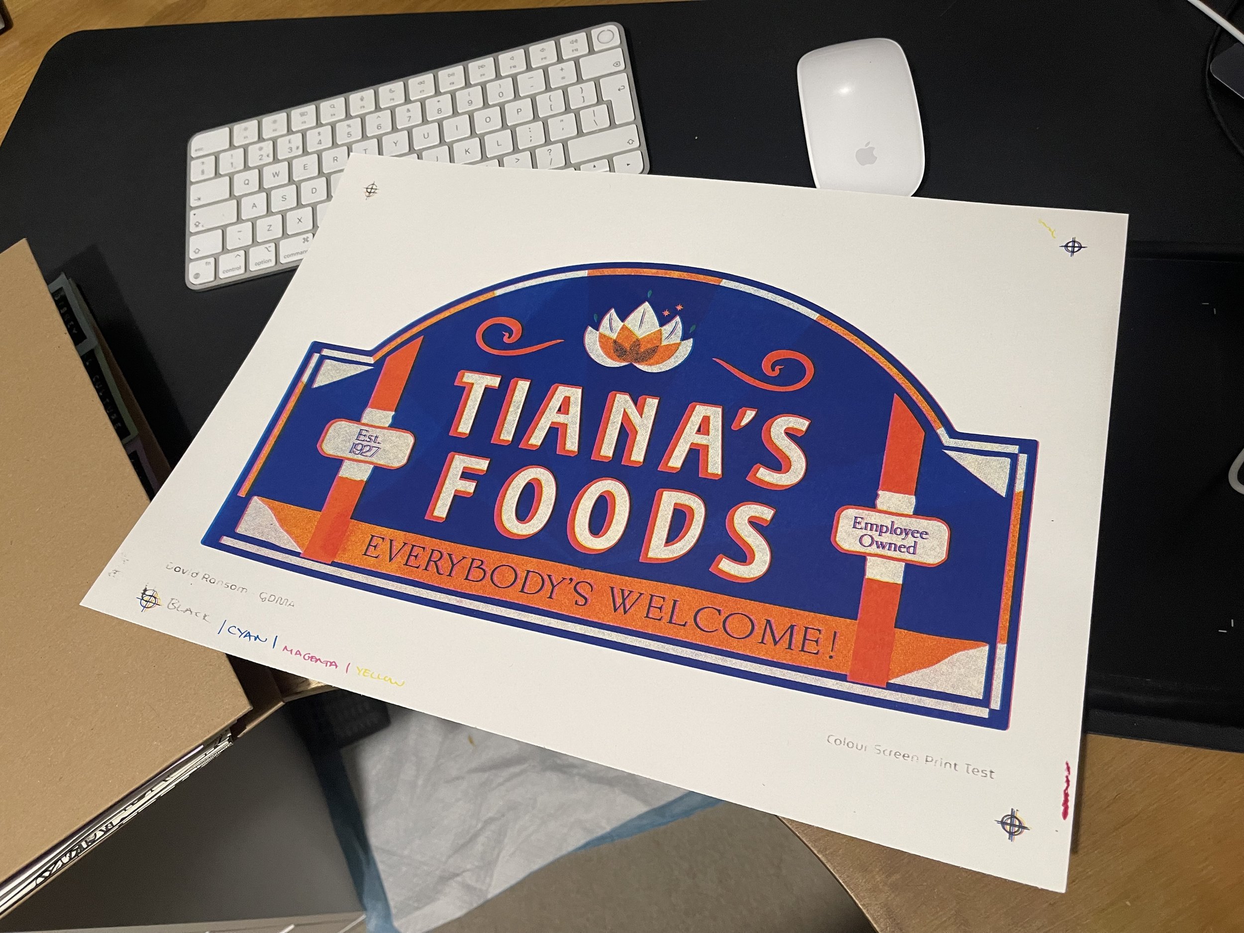
I was working on a new poster yesterday and last night, that was a study on the new Tiana’s Bayou in Disneyland Resort, California. It’s a rethemeing of Slash Mountain as the source material of this attraction is problematic to say the least.
Anyway, I was thinking as I was working on it, that the style of the design is very floral and nature based. The attraction is based on The Princess and The Frog, the 2009 last hand drawn animation Walt Disney studios ever made, which is set in 1930’s New Orleans. So there’s lots of swamps, and veins, and dancing and jazz and everything that made the 30’s Deep South what it was. And I thought to myself, ‘I must look up and see if there is any historical version of this in the Grammar of the Ornament’.
And that’s when it hit me; what I’m making is a version of that book for Disney Parks. ‘The Grammar of the MAgic Kingdom’ as it were!
I’m on my way to the library now to see the printed version of that book to get an idea of how it’s put together, I’ve only seen the ebook version thus far. But if I can use that as a blueprint, I might be able to start pulling together the book I want to make.
One thing I need to look out for, is that the ebook and reviews I’ve read online have made it seem like there isn’t much analysis in the GOTO which I something I want to do. But the idea of laying our examples of work from “around the world” and then using them to make a design philosophy is exactly what Owen Jones was doing in the 1850’s!!
2025
Just before the end of the semester last year, we were briefed in on the contextual report which will be a 15000 word essay on the process of what I’ve learned and found out and how I did it along the way. I’m very glad I kept up these blog during the process so far as they will be super helpful for this.
One of the things Mike said whilst briefing this was to look back at the work I did for proposal and what that meant and what it means now. Am I still heading in the same direction as I was then or have a deviated? I understand the point in this work is the deviate and come back to somewhere near where you started, having gone on a journey of discovery. Well you can so that. Some people go off and never come back to the beginning.
But what I did think about my proposal was my motives for doing this work. I think because my proposal was based so much on the spacial transmedia study done by Rebecca Williams, I think I was in a mode where I was trying to prove the worth of studying theme parks to academia in general. Something that that book does a lot in the beginning. But the more I read and the more I learn, especially after reading John Hence’s book; Designing Disney, I feel like that might not be the best use of my time. I know this work is worth exploring and the more practical work I do the more it feels like that speaks for itself. It would be a lot more interesting to not spend my time proving this work is good and true and worth studying, and actually just get on with the practise of studying it.
I’ve read a lot in the last few weeks, about analysis, about the etymology of design and about disney so I’m still moving toward creating my own version of an analytical model. I’ve had from the start of this project a list of names of people I want to speak to who either work at or have worked at Imagineering, so I want to start reaching out to them. But I want to make sure I do that properly. I’ve been speaking to someone on reddit about trying to track down a 60 minute episode that featured on the Imagineering Story documentary, but having no luck and it turns out he worked at WDI in the 90’s as a graphic designer! So thats fortunate! I’ve asked if he’d be up for talking about it, so fingers crossed I can start that process soon.
I have some images to start on another poster, but I also need to spend time reading and work on this analytical model so need to prioritise.
Poster 5
It’s a week before Christmas and I’ve just completed my 5th poster, this time for Star Tours in DLR. I’m glad I got to 5 posters before Christmas as my plan is to aim for 10 in total but I’m starting to think maybe this is too many? See what Mike thinks. But it at least means I’m half way there and I’ve been sent some images from a person on reddit from the new Tiana’s Bayou adventure, which used to be Splash Mountain, but was rethemed as it’s based on Songs of the South, a very racist 60’s movie.
Anyway, as I’ve said before, I feel like I’m at a good stopping point for the practical aspect of this work for now, and can start building on the theory side.
I spoke to Mike a few weeks ago about building an analysis model for critiquing the designs I’ve been studying and he pointed me in the direction of film analysis and Geothen analysis. The film one is a great path to go down and I’ve stated to do so. Mainly with an easy overview video on youtube to get the basics down, but I need to spend some time reading so things that will give me a greater understanding and view point to build that out.
The Goethen model was ‘interesting’. The reading I’ve done so far is about the 4 parts to this model, which starts great, and then goes on to talking about drawing the thing you’re looking at, which is great as this is what I’ve been doing already. The last couple steps however are a little much for me. I don’t know if it’s me being narrow minded, or something else, I it all felt a little pretentious and without use. I spoke to Mike a while ago about this issue of having worked as a designer for a while now, it’s difficult for me to not think of the solution to a problem, and then work towards it. A large part of this course is to fuck around and find out, but maybe imagining the subject ‘preforming a gesture that describes itself’ feels like a step too far for my nero spicy brain!
Anyway, back to the print. This is the second study I’ve made in which actual type faces have been used, which obviously means I’m able to put them together a lof quicker than the hand drawn stuff. Making use of the font identifier on Myfonts.com, I was able to find a few different types being used and use them in the designs. What was super interesting was where the designer had clearly used a type face for the work, but sometimes actually cobbled two together to make something work. The Starspeeder 1000 logo and the Lightning Lane sign were examples of this. I’ll have to check my .ai files to find the exact names, but they’ve used one font for the whole thing and then swapped out, say the ‘N’ with another font entirely! A very weird thing to do, but because the Goethen model of recreating the work I was able to find this out. I wonder why they did this? Or have I downloaded cheap fonts that aren’t the correct ones they’ve used? Who knows.
3rd December 2024. Poster 4 and Tutorial
Poster number 4! Kevin the ghosting Disneyland Paris reemerged finally and actually sent through some images, so I was able to finish the Tower of Terror study.
It was interesting doing this study as this was the first time i was working on designs that featured actual, recognisable type faces and styles. Everything I’ve worked on so far has been hand written or painted type on hand draw signage. But this was lots of art deco straight lines and type which was an interesting change, and also meant that it came together a lot quicker once I’d found that font.
I also had more success printing this week and realised that i really just needed to use a thinner mix of ink because I’m screening such detailed, small lines. So having figured that out, i went back a reprinted some mark Twain prints as i didn’t have much luck with those last week. They’re just drying now.
I also sat down with Mike to discuss how to move forward with the process part of the study. I explained that I’m thinking that i want to make these posters, and then develop some form of lens or prism or matrix to analyse them through in order to create a result from each one, then in turn will become a philosophy of design at the end of the project. But what i want to do i find some examples of other people doing the same thing so i can cherry pick ideas from those studies to build my own. The issue I’ve been having is that I’m not able to find examples of this within Graphic Design. When you search of GD examples of this, you only find articles about ‘How to critique other peoples work” teaching you how to speak to people about their work, not literally how to do it. Mike suggested that i look into other fields of study and see what examples i can find of people doing the same but in literature, science, film or philosophy. This is an interesting idea i hadn’t thought of, as it doesn’t really matter if the other studies I’m referencing are design based, and in actual fact it’s probably more interesting if they aren’t.
The next step is finding those studies…..
He’s sent me a few things to get started with, but now i have the four posters i want to get busy reading and making this prism stage of the project.

Printing 26th November 2024
Today was a tough one! I was in back in the printing studio, screening my third poster. This time a Mark Twain Riverboat study. Non said this was the best poster I’ve made so far, so I was very happy with how the actual design work turned out for this, but todays printing didn’t go super well. I think I got a few good prints off so that’s all I really need, but it was very hot in the studio and the ink kept drying out so I could only get 4 or 5 prints done before I had to clean the screen out. I’ve kept the screen so I might try again in a couple weeks when it’s not as hot.
I’m now at a situation where I’ve run out of images from people so I can’t move forward with any more posters until I do. The situation with Kevin continues to be odd. He’s suddenly got back in touch saying he got ill and thats why he ghosted me, and has sent some phone photos whilst in the park but still hasn’t sent anything to the Dropbox folder! It’s very annoying and very weird. He showed me a photo of an accident form from something that happened in the parks and I saw his information and age, so I do know he’s a real person, and is 30 years old, but is maybe just an odd person. I haven’t heard from the other people in a couple weeks so I need to chase them up.
In the mean time, I should start refocusing on the reading and planning part of this project, because I can feel that falling behind. I was speaking with Non the other day about the book, or whatever the outcome of this thing is…probably a book, and the sections it would be. I would want to aim it at a general audience initially and then go into the design stuff later in the book. So the intro would be about Walt, his life and philosophy’s. Why he decided to make Disneyland and what it’s primary function was. Then about Imagineering. Why and how it was set up, who the key players are and what they’re responsible for. The I would go into the case studies. Hopefully I’ll have about 10 of them from around the world, but this is something I need to break down. They’ll be what we are looking at, what it’s function is, what era is it set it, what story is it telling and how was it made. Who is it aimed at? What are the designers trying to make you feel, based on either knowing that from other sources, or what peoples’ take aways from it are. Maybe this could be some more primary research with Disney fans?
The last part of the book would be some kind of statement about the philosophy of visual design in imagineering. I would love to take that project as a prototype to work on a full coffee table book for Disney, but thats maybe getting ahead of myself.
Tutorial 19th November 2024
Speaking with Mike today was a series of showing the posters I have created so far, those being Dapper Dans DLP, Jungle Cruise and the EPCOT Etsy print. The Etsy print was set aside and not really discussed, so I don’t think thats an avenue of study that needs to be explored. I think this is largely because I’ve thankfully zeroed in on working model that is paying off quite early in the experimental process. That being, creating a series of posters, each one a study on the Graphic Design within a specific place or attraction in the parks around the world. And then analysising them to create a Philosophy of Design within the parks.
The flip side to this, Mike suggested, could be a study on what it’s like to visit the parks as a designer? Or simply, how is graphic design used in the spaces within the parks? On this, he suggested I look into Graphic design in architectural spaces. How spatial Design makes us feel and how it is used.
The lead us to talk about Psychogeography which is something Dan suggested last year, that I don’t really know I whole deal about and therefore need to look into. Its something about how graphic design maps a space and how we interact with it as we move through said space.
I also need to revisit semiotics, to look at how their models of thought can be used to analysis shape.
We spoke to lot about the heritage to the design works in the posters I’ve made so far. I explained how I feel like everything I’ve looked at some far is Victorian in origin and therefore hand lettered or painted, and so I wanted to look at something in Tomorrowland (Discovery Land in DLP) as this may have more hard lines and formed lettering and signage. Mike said that maybe sticking with the Main Street and Adventureland stuff would be good in order to group the studies into themes. This is all dependant on what types of primary research I can get back from the various people how are collecting it for me. But through looking at Victorian style designs in the parks, I can start to think about where those designs come from, i.e. European designs that in tern came from Roman or Greek designs that Victorian era people would study on their trips and bring back into our world. Does the sense of comfort and reassurance that the imagineers (Hench?) talk about that the parks give us, come from the heritage designs used in the attractions’ wallpapers and ghost signs? Is that sense of reassurance from a by gone ear, a personal one or a cultural one? I was also reading today the study that looked at how their original Main Street USA of California was translated to the other parks around the world, and especially how the semiotics were recontextualized at the Hong Kong park where they made an exact replica of CA but the guests there don’t understand culturally what Main Street is.
The book Grammar of the Ornament was suggested to look at about the Victorian style of design and where is came from. What it was referencing and what it meant at the time. And therefore what the copy of it represents in Disneyland. This also ties into Simulacra and stimulation talking about Disneyland being a copy of a copy and therefore a hyperreal cultural meaning.
It’s interesting to think that Disneyland is a cultural American icon ‘as American as apple pie’ but all the design work in there is based on European Victorian style. What American’s think of as quintessentially them, is actually us! (Us being europeans).
The last thing we spoke about was the poster book having a cover that used some techniques from sign writing or letterpress. For example gold leaf or embossing.
TLDR:
Study Graphic Design in Architectual spaces
Study Psychogeography
Revisit Semiotics
Read Grammar of the Ornament
Start to think about contextual paper. Why am I studying what I am and what do I want to show from it?
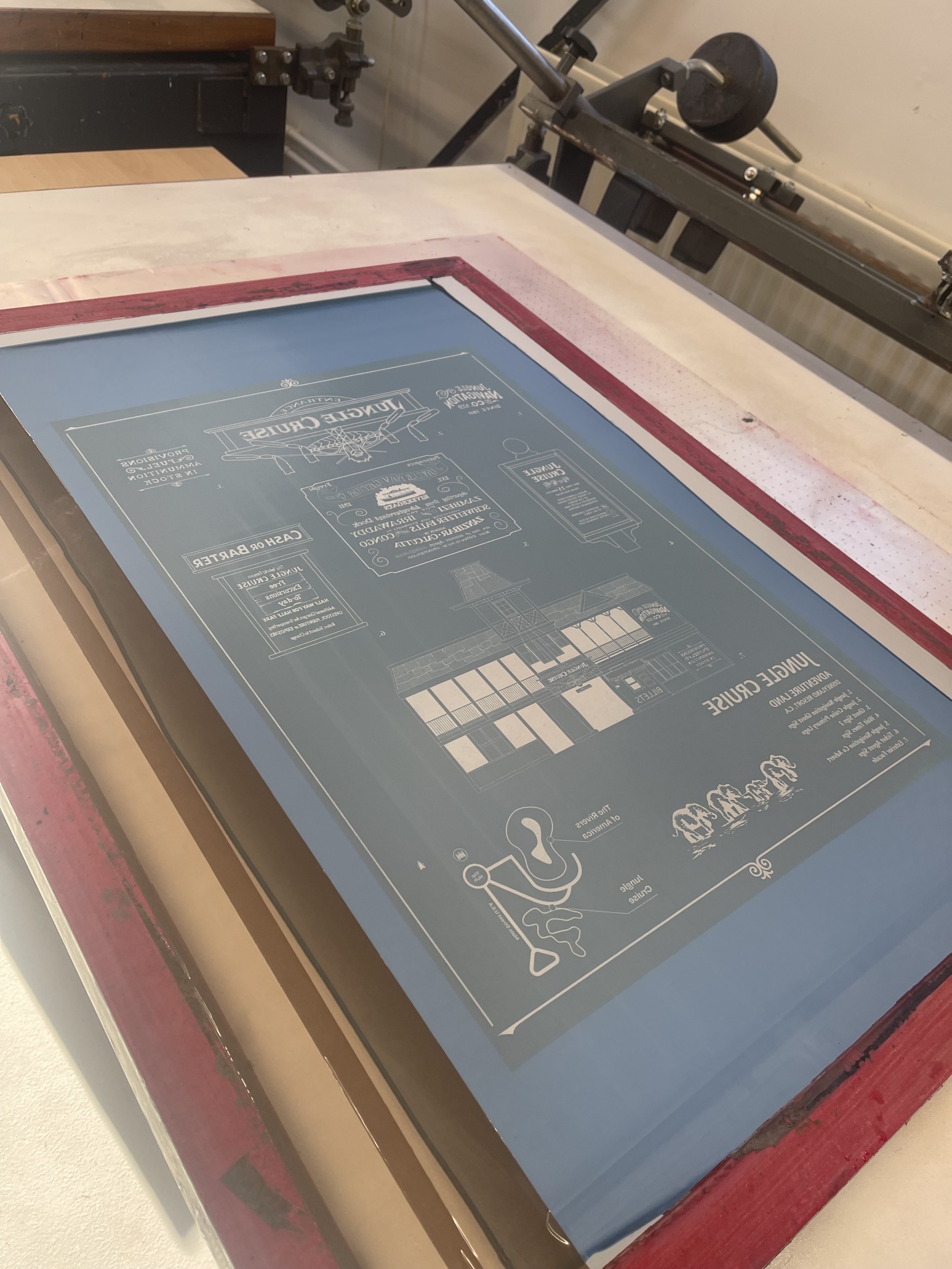
Case Study #2
My second informational graphic poster is based on the Jungle Cruise attraction in Disneyland California. I’ve been speaking to people on various platforms around Disney fandom including Disboards and Reddit, to find people who are able to go to the parks for me and gather photos of the types of details I need in the attractions / shops / restaurants, to make the case studies from. With varying success.
The best result I’ve had is from a man named Mark (or Mike) who is a regular to the Disneyland Resort California “a few times a week”. He’s been great in collecting images for me and suggested the Jungle Cruise being a good place to start. He’s also sent some images of The Mark Twain, a riverboat that circles the Rivers of America inside the park. This will probably be my next study but I’ll need more images from him. The less promising example is from a man called Kevin from Europe who goes to DLP most weekends. My partner and I Have been trying to work out what the con is with this guy as it appears there is one, but not a very good one! He started by emailing me very often and said he would help get accommodation in the park if I wanted to come over for the weekend. He was cc’ing himself in his emails with a @disney.com email address which I obviously can’t verify. He was then WhatsApp messaging me from ‘inside the park’ and said he was taking photos of the Tower of Terror. So I started working on a poster for that, but when I asked him to send the photos, he ghosted me! I havent been able to get hold of him since and for the life of me can’t work out what he was trying to achieve. As no point did he ask for money or any commitment from myself that would be advantageous to him! Very odd.
I’ve had a few other people get in touch, but those are running thin, so need to start making more connections to get these posters sorted. I’d like a nice round number like 10 but if I have to wait until march when I go to DLP to get them done, I’m going to be up against it to finished the project in time.
This time working the screen printing studio wasn’t as straight forward as the first two times. I didn’t get the work bench I usually have which wasn’t ideal and the ink wasn’t coming through as well as before. So it was a bit of a challenge. But I think I got 5 or 6 good prints which is all I really need.
The other issue I’m coming up against is getting hold of books. All the Disney or imagineering books i have on my list i need to buy because they don’t have them in the library. But it’s such a gamble to spend that money on books only to find they are the right ones or as relevant as i need them to be. Maybe I’ll speak to the library and see what they can do. I’ll add that to my list….