Draplin Design Co. Pretty Much Everything. Aaron James Draplin.
Aaron Draplin is a logo designer that really helped shape how I designed in the early days of my work. As I am largely self taught as a graphic designer, I spent a lot of the first few years of work watching online tutorials, reading blogs and subscribing to YouTube channels, and one of the main people that stood out, amongst others, was Aaron. It started with a lot of Skillshare and lynda.com videos showing his design methods, where he looks for inspiration from and showcasing his specific style of logo making. See “Logo Design with Draplin: Secrets of Shape, Type and Color” on Skillshare.com.
These videos were great at showing workflow and how ideas can develop and transform from the initial concept into a fully realised logo, but as I am finding in this research project, he often talks more about the ideas behind what he’s doing and not about how he’s actually drawing the images.
I got Aaron’s book, “Pretty Much Everything”, some years ago really as a reference and inspiration book. As the title suggests, it’s pretty much every logo Draplin has produced which is really useful as reference material, usually shapes of the logo or the style of the concept. What I realised was that I hadn’t actually read the text to gain any insight into how he developed this style in the first place.
The text is set out as a memoir. It tells Draplin’s story from his early influences in skateboard graphics, to college where he “learned how to draw naked people, take and develop pictures, draw in painstaking perspective, paint… write a paper and use computer drawing programs to draw things in vector form.”(Draplin, 2016) It seems, like many of the other people I’ve spoken to or read during this project, that a illustrators style is formed very early on and progressed upon.
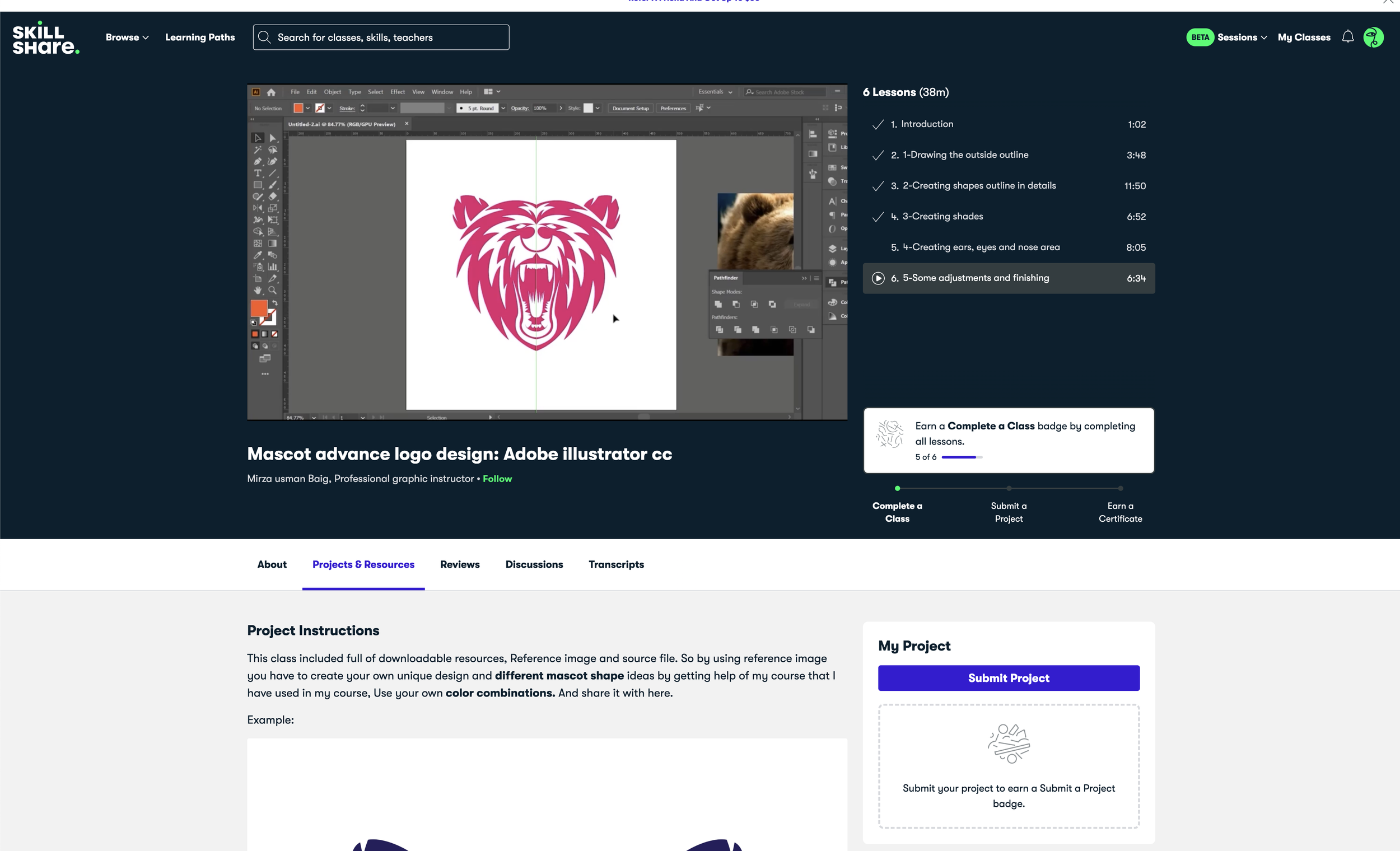
The rest of the book has a lot of useful information about Draplin’s philosophy of logo making and how much he cares about each part of the process, “And I love this. It takes work, sketching, research, thinking flipping, flopping and tons of refinement.” (Draplin, 2016) but whats missing for me, and what seems to be becoming a standard issue with this project, goes back to The Reflective Practitioner, where he states “competent practitioners usually know more than they can say.” (Schon, 1983). I have already discussed this in my analysis of Mirza Usman Baig’s Mascot tutorial “Mascot advance logo design: Adobe illustrator cc”. When a designer discusses their work and whats being made, but rarely why the decisions made were made in the first place.
Aaron Draplin is a very talented designer and is one of those electrifying people that make you feel extremely enthusiast about design and getting things done. But as I’m finding time and time again, he offers no insight into his abilities aside from being good at drawing from an early age. Maybe there is a nurture / nature debate here and some people are just born better at drawing and build from that?
Made by James. The Honest guide to Creativity and Logo Design. James Martin.
Another book in my collection of logo inspiration is Made by James, a logo designer from the South Coast who, it seems, has been heavily influences by Draplin. James’ book comes a few years after Draplin’s but follows a very similar theme in design style. What sets it apart, and what I consider more useful, is that the book is set out more as a ‘how to’, with chapter titles like ‘Habits and Routines’, ‘Working with Clients’ and ‘why I draw’ (the latter being, a philosophical look on why drawing is important). Unfortunately for me, there isn’t a lot in here about how to draw or why he draws in the style that he does, only that his “passion for drawing started at a very early age” (Martin, 2016). He also discusses in this section why it is so important to draw and show your drawings to clients, which is interesting. “The reason I get a lot of clients is not because of the final execution of the logo, but because I show the journey of its creation.” (Martin, 2016). I’ve never included the drawing and process images in my own client presentations but maybe this is something I should try. If the connection with the work is as strong as Martin says, it might be worth including.
One section I find very interesting in this book is the section on failure. It reminds me of the famous Walt Disney quote “It is good to have a failure while you're young because it teaches you so much” (Disney, Various). Even through I’ve read or heard that people are good at drawing from an early age, no one is born an expert at design or illustration. “I had to learn a lot, and I needed to be persistent and practise daily to keep the area alive.” (Martin. 2016). It also reminds me of the conversation I had with Ken Ashton, and how there are people with different skill sets, who bring different approaches to a brief, but will often have gaps in their knowledge that other people wouldn’t have. Martin acknowledges his flaws and states that practise and dedication, and time spent working on them is the only way to progress at them.
I’m starting to think the formula for being a good illustrator, or a good designer for that, is being skilled at an early age + the love and passion for doing it + daily practise. I think the issue I find is finding time to set aside from this practise and not bing discouraged when it does not go to plan.
In his 2006 Ted Talk “Do Schools Kill Creativity?” Sir Ken Robinson talks about quite a few points raised here. The first being making mistakes.
“What these things have in common is that kids will take a chance. If they don't know, they'll have a go. Am I right? They're not frightened of being wrong. I don't mean to say that being wrong is the same thing as being creative. What we do know is, if you're not prepared to be wrong, you'll never come up with anything original -- if you're not prepared to be wrong. And by the time they get to be adults, most kids have lost that capacity. They have become frightened of being wrong.” (Robinson, 2006)
It’s interesting to link two ideas gained from these books and other reading and research I’ve done, in which to say that a designers style is largely influenced by their childhood and what they were drawing when they learnt to draw. And secondly that making mistakes is something we’re perfectly happy to do as a child with no self-conscious shame attached to it. We make mistakes until we make less mistakes and we don’t get frustrated, we don’t give up and we don’t feel like we’re wasting our time. I feel I have let this research project fall to the back of my mind as I’ve been working on a lot of document work since the start of the year and therefore not as much branding work as I usually would. Because of this is haven't dedicated a lot of time to getting good at illustration branding and so it’s been hard to justify the commitment. This was until yesterday when I had to produce a logo for my partner who’s running a marathon and needed a social media brand for raising money. And I found it a challenge because I hadn’t spent more time practising my new skills.